Whoever said “never judge a book by its cover” definitely never took a marketing class.
Obviously, we shouldn’t judge books by their covers–the contents matter, and it’s not totally fair that we make snap judgements based on the cover, the blurb, or the first page.
But we do. And especially now, in the digital age, where people sort through books by scrolling through what are functionally thumbnails of your cover art…like it or not, your cover matters. An intriguing cover can draw someone in, while a cliched, dated cover can keep readers away.
Fantasy books in particular have some issues with cliche when it comes to book covers. You don’t want yours to be lost in a sea of hooded figures holding daggers against a white and black background, but you don’t want yours to look out of place, either.
In self-publishing, you’re in full control over your finished product, but picking out a cover can feel overwhelming, especially if you’re not artistically inclined or well-versed in graphic design.
So what should you do? Stay tuned! We’ve got some tips on how to make a good fantasy book cover, some examples of great covers, and a list of fantasy book cover artists to check out.
What Makes a Good Fantasy Book Cover
What makes a book cover work? And what makes for a great fantasy book cover?
We’re going to cover the components of book covers, what they can do, and how we can use them to convey information to our audience about our book’s themes, target demographics, and subgenre.
Elements of a Fantasy Book Cover

Miblart.com outlines the three major elements of book design as typography, imagery, and color scheme. Across all genres, a book cover is going to consist of these three pillars, and these are the tools we’ll use to get information across to the audience. Let’s go through them one by one a little more fully:
1. Typography
This is the font you use on the cover. Sometimes authors will use a different font for their title, subtitle, and author name–sometimes it all matches. Don’t think this matters? Grab the nearest book off your shelf. Would it honestly look as good if that font were, say, Comic Sans? Probably not!
You’ll notice that certain genres have certain tendencies towards fonts. Romance titles tend to be more swirly, while nonfiction and memoir trend towards academic fonts. Take a look through the fantasy aisle at your local bookstore and note the trends you see!
2. Imagery
This is the pictures and images used on the cover. This is where a lot of well-known cliches come in–we’ll talk about those later. Finding good imagery can be especially challenging without a background in graphic design. It turns out you can’t just find a free photo on Canva and slap it on your cover (or, well, you can, but it probably won’t look great).
Do you want a person on your cover? A painting? Abstract art, or something minimal? While you’re on your bookstore field trip, note the imagery that pops up. See if you can spot trends by subgenre or decade!
3. Color scheme
Last, but certainly not least, we have: color scheme. Anyone who’s taken a marketing or graphic design class can tell you that the colors you use matter a lot.
Social media sites tend to lean towards blue backgrounds, since those colors boost your alertness, have proven to be almost universally appealing, and tend to make people feel safe and creative. Red is an urgent color that catches your eye–when you walk into a supermarket, notice all the bright red or yellow price tags.
It’s no different when you’re putting your book together. Having a grasp on what colors mean and how they work can go a long way in conveying your mood and theme. A dark purple cover with rich green foliage gives a creative, moody feel, while a minimal white cover with straight blue lines might feel more like a textbook.
On your bookstore field trip, note trends in color schemes. Don’t pay attention to the imagery for this one: just see if you can see recurring colors or color schemes.
Urban Fantasy vs High Fantasy Book Cover Designs
Urban fantasy is all about mixing the magical world with our real world. How do we get this across in our book cover? We show both! Maybe you have a photo of a regular-looking teenager wearing contemporary clothes, but she’s standing in a medieval castle. How’d she get there? Tell me more! It might look more like a contemporary setting featuring something magical going on, like a street corner with magic lightning jolting through it.
By contrast, high fantasy takes place in its own universe, so your task here is a little different. You’ll want to give readers a hint of what sort of universe they’ll be entering into.
A more sci-fi cover might feature some sci-fi looking elements, like a spaceship. A more epic high fantasy vibe might be a knight in full armor or a medieval-looking scene. You’ll want images that get across what your world is like, a color scheme that conveys the mood, and typography that ties it all together! High fantasy especially tends to go for an epic, dramatic feel.
Fantasy Book Covers for Adult, Young Adult, or Middle Grade?
Your cover should also look appropriate for your target demographic. There’s a world of difference between Stephen King’s latest cover and the covers on the Junie B. Jones books, right? This is because the genres and target audiences are radically different. Cover art is meant to catch the viewer’s eye, and depending on the viewer’s age, different things will catch their eye.
1. Middle Grade
Kids are drawn to brighter colors, more punchy fonts, and action scenes. Children’s covers often look like something out of a comic book, with friendly illustrations and an intriguing title. Middle grade covers are a little more mature–we might have imagery closer to what we would seen in young adult or adult covers, but it should still feel kid-friendly.
Middle grade fantasy covers often feature real people, for example, to get kids’ attention. The title should be clear and easy to read, and in general, it should look exciting.
2. Young Adult
Young adults covers are a little more mature still. You may remember the long-standing trend of fantasy YA covers featuring women turned away from the cover–A Great and Terrible Beauty by Libba Bray is a great example. Because young adult fiction is more likely to deal with serious romance or darker themes, we’ll see more mature color palettes across the board.
Recently, YA covers on the whole have shifted to look more like adult covers. There are plenty of adult readers still reading YA novels, and marketing to them as well as to kids goes a long way in boosting sales.
3. Adult Fantasy
While YA and middle grade covers need to catch the eye of their younger audience quickly, adult fantasy has a little more wiggle room–just a little, though. In the digital age, it’s become especially important to create impactful covers that also make great thumbnails, and having an obscure, complicated cover won’t help you out.
Adult covers in general tend to feature less real people–you won’t see as many actors on the cover, and you might see more mature illustration work. If you do see people, those people will reflect the target demographic–it won’t be a kid, it’ll be an adult. A fantasy romance, for example, might feature two adults posed in a risque manner. This makes it pretty clear what the book is and who it’s for.
Watch for Clichés with Your Cover
Whatever your genre, subgenre, or target audience, watch for cliche!
Even if you’re not reading contemporary fantasy books (which you should be, if you intend to publish one), you should at least be taking a look at the covers when you go to publish. Twilight, for example, set the tone for paranormal romance covers for… well, at least a decade, and arguably forever. Dark backgrounds with bold, saturated objects in the foreground basically dominated the aisle at B&N for a hot minute.
This is because readers like things that are familiar, and fantasy readers are no exception. If you go to the bookstore and you see a book that reminds you of one you loved, you’re more likely to pick it up and check out the blurb. It’s good to keep tabs on trends to play into this, but it can go wrong quickly.
For example, you don’t want your book to look dated. Women in billowing dresses running away from the viewer, for example, is a long-mocked cliche in YA fantasy. More contemporary examples include hooded figures with daggers, black and white backgrounds with slashes of color in the foreground, or so. Many. Men. With. Swords.
Having a woman in a billowy dress or a man with a sword doesn’t automatically make your cover cliche. After all, creating a modern fantasy cover that fits with the rest means it’ll share some elements with others. But before you settle on a design, take another field trip to your local bookstore. Does your book look like it would fit on the shelves with the new releases? Does it look more like it belongs in the 1990’s, or does it look too much like everything else?
It takes some tinkering to find a unique design, but it can be done! Let’s look at some phenomenal fantasy covers for inspiration.
Fantasy Book Cover Design Examples to Learn From
As we say here at Self-Publishing School, learning by example is often best, which is why we have our coaches work closely with authors who join our programs—including our Fundamentals of Fiction & Story program.
To get a feel for all of this advice for your book cover in action, check out these examples and really digest their differences so you can learn and implement for your own book.
1. A Darker Shade of Magic by V. E. Schwab
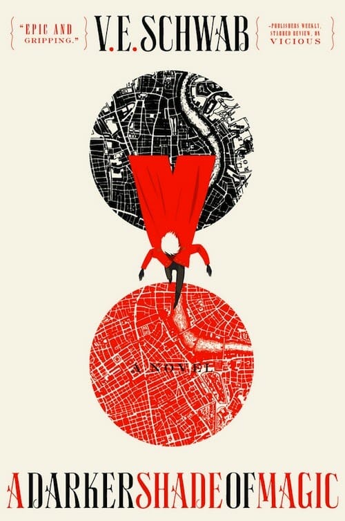
The sharp color contrast on this cover draws the reader right away. The font is a little whimsical, but still completely legible, and the balance between red and black as well as the symmetry on this cover make for an appealing visual.
2. The Priory of the Orange Tree by Shannon Brown
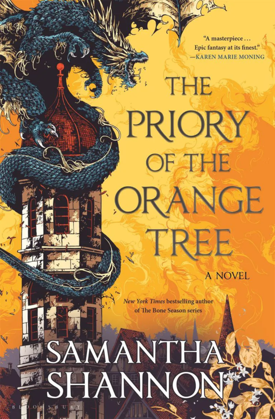
This is a classic example of using sprawling imagery and a dramatic color scheme to sell a high fantasy novel.
We’ve got a dragon and a castle right on the cover, both giving us a solid idea of what genre we’re dealing with, and the color palette conveys all the fire, magic, and intrigue to come.
3. Gideon the Ninth by Tamsyn Muir
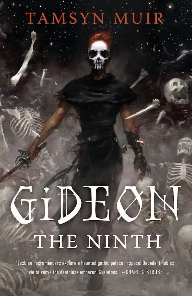
We have a dark color palette here, with a high contrast that draws us to the character’s face and makeup. We see skeletons, we see a sword, and there’s ‘Gideon’ in a font evocative of a boneyard–we also get a great glimpse of the sky above, hinting at space.
What sells this cover for me, personally, is the best blurb of all time printed just below the title.
Fantasy Book Cover Designers
Hopefully, you’ve learned from this that it’s imperative to invest in a good cover. If you’re self-publishing, you’re responsible for coming up with your own cover, but there’s no need to panic if you’re not an expert cover artist already. Here’s a list of fantasy book cover designers to check out!
While we wish they didn’t, people do judge a book by its cover, which is why we always recommend a professional book cover design, especially if you’re going to self-publish your book.
Want real-time feedback on your book cover designs?
Our students get that everyday in our student coaching groups! To learn more about our self-publishing school courses and coaching options, check out the resource below or book a call with one of our Publishing Strategists!
