Have you ever walked along the isles at Barnes & Noble or scrolled through a certain genre of books online, saw a cover you thought looked interesting, and clicked to see more?
We’re often told not to judge a book by its cover, but unless someone refers a book to us, the cover is usually what first catches our attention, it leads to sales of you children’s book ultimately.
While by now you’ve likely read enough books to know a great cover doesn’t necessarily promise a great read, and a bad cover can sometimes hold a fascinating book, children don’t.
Like it or not, telling someone not to judge a book by its cover doesn’t necessarily apply to children’s book covers. As far as children’s book covers go… an engaging cover is essential.
Remember, young children are fascinated by what they see. All of life is new for them. Plus, young children’s attention spans are short. It’s crucial to grab their attention by at least the first page of your book, but ideally, by the front page of the book—your book’s cover.
First, let me congratulate you on realizing the importance of your book cover. You wouldn’t be here if you didn’t believe a great book cover can take your book from the shelf to the hands of those little ones. This and other epiphanies to be had in our children’s book school.
- What Makes A Good Children’s Book Cover?
- How To Find A Children’s Book Cover Designer
- What Goes On The Back Cover Of A Children’s Book?
- Good Children’s Book Cover Examples
What Makes A Good Children’s Book Cover?
A great children’s book cover should be engaging. That’s a great start. But how do you practically make a cover engage a child? How do you even know where to start?
It comes down to branding. Brands are strong whether you plan on publishing once or with a series of children’s books.
When thinking through your cover, consider your brand. You write for children, so cartoon-style characters are probably going to fit better than a photo of a real person. Cartoons are engaging and fun.
Also think through your colors. Children love prime colors. They also love sparkles, bedazzled, and camouflage. What is the tone of your book? Is it a bedtime story? Consider using calming pastels. Is it a book about going on trip with family? Consider using colors that are more bold like reds, greens, and blues.
Maybe your protagonist is a shy little boy. If he is represented on the cover, allude to his personality in how you color his clothing. A shy little boy would probably wear more muted tones than an outgoing child.
Note: When choosing the background for your cover, remember to reserve space for your title. If you want your title to be in big, bold, blue lettering, but you have a cloudless sky taking up the top third of your cover, this may not work out well.
How To Find A Children’s Book Cover Designer
If you’re publishing a children’s picture book and you already hired an illustrator, a natural next step would be to talk with them about designing your cover.
This will help in a several ways:
- You already have a working relationship with the designer.
- They already know your story.
- They know the type of illustrations you like.
- Your front cover will align with the style of your illustrations.
If your book doesn’t have illustrations, or you want to find someone else to design the cover, a simple Google search can bring you a wide array of possibilities.
Referrals from other writing friends can be helpful at a practical level, because your friends will be able to tell you what they liked or disliked about working with a particular illustrator.
Writing conferences, online writers groups, or local colleges are all great places to look for contacts as well.
Finding an illustrator with the style you want may be difficult at first, so go to the library or your local bookstore, browse books until you have a stack of five or ten covers you really like, then take photos of the covers and write down the name of the cover designer. If nothing else, you have design inspiration to show your future designer, and who knows, if you try contacting the designers of these covers, they may answer!
What Goes On The Back Cover Of A Children’s Book?
Just as with middle grade (MG) young adult (YA) or adult books, the back cover of your children’s book should contain your back-cover copy. This is a brief description of your book, condensed into a few short paragraphs, with a teaser at the end to intrigue the reader into opening your book and reading it.
If you wrote a book proposal, you could use your synopsis as a rough draft to start your back-cover copy, and possibly use a portion of your elevator pitch (EP) as your first sentence.
Remember, an elevator pitch is intended to tell an agent or acquisitions editor what happens in your book from start to finish.
Back cover copy is intended to give the reader just enough information they can’t help but open your book. Don’t reveal the ending!
On your back cover you should also include a brief author bio. Again, if you have a book proposal feel free to pull your bio from the one-sheet in your proposal and use it as a template. Your bio can be in first or third person, should be professional, include any major accomplishments that make you a credible writer for this book, and be written in a way that also reflects your personality.
Often, an author will include a professional headshot with their bio. This should be a photo taken by a professional photographer. Before getting your photo taken remember to wear clothing that reflects you as a professional author.
Good Children’s Book Cover Examples:
We’ve covered where to find a cover designer as well as the type of copy that goes on the back cover. To help you feel fully confident as you finalize the look of your cover, let’s go through several examples of great children’s book covers:
1. My First Emojis: How’s Emoji?
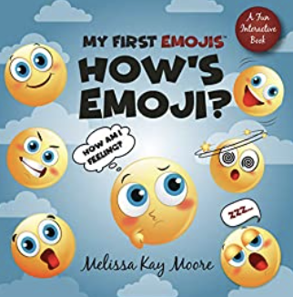
This cover has consistent, muted, pastel tones. The emoji faces are engaging: silly, tired, surprised, and happy, and communicate well with children. Also, for children who play on their parents’ phones, this is a great cover because it relates at a daily level.
2. Be. Here. Now.: A Guided Meditation for Children
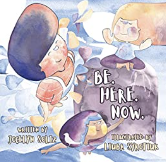
When you think meditation you likely associate it with calm and quiet. These muted tones are nearly translucent, almost like a watercolor, and reinforce the title. The children depicted look happy but calm, which again, reinforces the copy of the title. The font is childlike, resembling something a child may have tried to draw.
3. Adventures of Klaus, The Happy Schnauzer
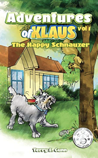
The way Klaus is looking at that squirrel, it already appears he’s about to head out on an adventure—up a tree! This type of cover plunges the viewer into the scene and helps them subconsciously ask questions: What is Klaus doing? Is he running away from home? Will the squirrel get away? Where is his family?
4. My Favorite Letter: The Alphabet Comes Alive!
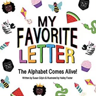
When children first learn to read, they often associate letters with simple photos. They may be taught “S says sss like in snake,” or “W in watermelon.” Depending on their age, a child may be transfixed with trying to name everything on this cover. The bold colors are engaging and confident.
5. The Wild Boy
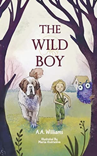
This cover is particularly engaging because the way the trees frame the sides, it looks like the three characters are about to enter the woods and run into the viewer. The lighter colors provide a dichotomy between the house in the background and the dark, wildness of the woods.
6. Gustave’s Adventures

Simply from the cover, it’s easy to tell this book is a happy, child-friendly story. Gustave smiles as he waves, and the colors are cheerful. The water is rough but not scary, the woods look exciting rather than intimidating, and the primary colors reinforce familiarity.
7. Two Countries One Me
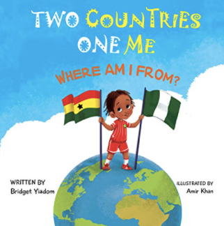
This is a bigger-concept title and the straightforward design helps articulate what it means. Having one child standing between two countries, holding one flag in each hand, is a great way to communicate a possibly difficult concept to a young child.
8. My First Steps
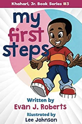
This book’s title portrays that it’s about learning to walk, but the cover has an appropriate focal point on the child’s shoes. The shoes are almost as big as the child’s head, drawing attention to them. Red is bold and confident, and an easy color for a child to connect with.
Just as children shout and point when they see something engaging outside, the same reaction should be true when they see your book. This is why it’s important to have an engaging book cover that draws the attention of those little eyes!
Enjoy following these steps and designing a cover that will grab attention and engage these new, young readers!
Want to learn more about writing and successfully publishing a children’s book this year? Check out the free training!


