


For a book to be successful, reader engagement is key. The best stories thrive on distraction-free pages, starting with great book layout design (what your book looks like inside). Whether this is your first book or you’ve published many, below, we’ll take a closer look at why your book’s interior can make or break a reader’s experience.
In this article, you’ll learn:


Book Outline Generator
Choose your Fiction or Nonfiction book type below to get your free chapter by chapter outline!
Book Outline Generator
Enter your details below and get your pre-formatted outline in your inbox and start writing today!
CONGRATULATIONS
Thanks for submitting! Check your email for your book outline template.
In the meantime, check out our Book Outline Challenge.

Why is book design important?
Your book’s cover and interior introduce your story visually before a single word is read. A compelling cover beckons a reader to open the book, and a professional book layout design opens a gateway to reading and keeps them on the page.
Ideally, your book’s overall design should set the backdrop for your story, not detract from it. Professional, quality design is how you transform a book that’s “just okay” into one that is memorable and referral-worthy.
When authors (and inexperienced designers) don’t understand the purpose of book design, it’s easy to end up on the extreme ends of the design spectrum. On one end, you have the author who sees design as only a means to an end, so they:
- Design the book themselves based on what they think will “look good” without the design knowledge or expertise to make design choices that will work in the marketplace.
- Don’t research their genre to understand market expectations and produce something that doesn’t fit into what a potential reader is looking for.
- Don’t have a strategy that considers future books and how consistent design plays into overall branding.
On the other end of the spectrum are authors who put great design (i.e., book formatting) above the story rather than as a supporting framework. When this happens, the following can occur:
- The design becomes its own character, and the reader doesn’t know whether to focus on the story or the design. (e.g., a fantasy novel with complex maps displayed throughout the book without regard to placement or how they help to move the story forward).
In the same genre, this can also occur with complex magic systems that require multiple charts to explain everything. While this is more of a writing issue, where less is definitely more, creating images to go along with such robust systems can pull the reader out of the story rather than complement it. - The design looks great, but it’s too much. There are flourishes, drop caps, pull quotes, and everything else but the kitchen sink. While it may look pretty on the page, if it impacts the pacing of the story because the reader’s eyes have to process lots of new information, they can easily lose steam and put the book down. Navigating a large block of text in a different typeface from the rest of the book or straining our eyes when one column of text suddenly switches to two and then back to one again turns book reading into a chore rather than a pleasant experience.
Immersing your reader into the story should always come first when designing your book, so avoid either extreme at all costs. Whether you design your book’s interior or hire a professional, finding this balance requires a strong knowledge of book design, genre norms, and audience expectations.
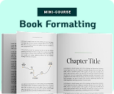
Book layout design essentials
Before learning how to elevate your book’s design, learning the basics is key. Wordprocessing systems like Microsoft Word and Google Docs have offered a false sense of security about what it actually takes to format a book. Since these types of software are intuitive and user-friendly, it’s easy to think that formatting a book is a simple process. Not so. Why? Because many bits and pieces go into getting a book’s formatting right, like a book’s trim size, content, readability, device, white space, and more. These have to be in place first before even considering stretching the boundaries of design.
Here are some foundational basics to know when designing your book’s interior:
Margins: Have you ever noticed that the interior and exterior margins of print books are different sizes? The interior margin (gutter) must be wider to accommodate the book’s binding. When designing a book, proper margins must be precise so the book’s story fits the page correctly.
Kerning: This refers to the spacing between each character of a word. When letters in a word are too close together or too far apart, it can make the eyes tired because they have to work harder to process the words on the page. Proper kerning means that spacing between characters has been optimized.
Leading: Similar to kerning, leading is also about readability, but it refers to the spacing between each line. If the lines are spaced too close together, it makes the content feel compact and suffocating. Releasing the lines to a comfortable reading distance can help with reading flow and even pacing.
Headers: This refers to the information in the top margin of the page. Often, this will include the author’s name on the top right side and the book’s title or chapter name on the left. Sometimes, you’ll find the book’s title on the top right and the chapter name on the top left. Other books may use headers for page numbers only or for nothing at all. Whichever you choose, consistency is key.
Footers: This refers to the bottom margin of the page that’s typically reserved for page numbers. (Note: Footnotes usually sit above the footer margin.)
Typeface: This refers to the design of the individual characters that make up each word. Not to be confused with “font,” selecting the right typeface can make or break a reader’s experience with your book. Choose clean and easy-to-read typefaces for your book’s interior, and leave the fancy ones for your cover.
Font style: Sans serif, serif, handwritten, thin, light, bold, and script all refer to font styles that fall under a specific typeface. How you use font styles can add richness and depth to your prose or pull a reader out of the story, so knowing how to use font styles correctly is crucial.
Formatting: This refers to how the content is displayed on the page.
Book design as a function of storytelling
I’d guess that 95% of the time, most fiction books follow a similar formatting style. The chapter headers may have different typefaces, and there may be a flourish or two, but you can expect to see single columns and lots of text.
There’s nothing wrong with familiarity. If it works, there’s no need to do something different, right? Not so fast. For those who are willing to make the extra effort to design a more unique experience for the reader, your book will be that much more memorable, especially if it’s done well.
In graphic designer Ellen Lupton’s book Design is Storytelling, and in her lectures, she often talks about the importance of seeing product design (including book design) as an integral part of the story’s arc. In the same way a story has character arcs, your book’s design should integrate seamlessly with the story while also maintaining its own arc. This means looking at design as a function of telling your story. It can be a basic foundation, like most books on the market, or it can provide a more interactive reading experience for the reader.
Here are five examples of elevated interior book designs done well:
1. The Selected Works of T. S. Spivet by Rief Larsen

Reif Larson’s book, The Selected Works of T. S. Spivet, is about a young cartographer’s solo journey across the U.S. to receive a prestigious inventor’s award. The book incorporates many of the tools common to a cartographer, along with journal entries and other relics, which lend to the story’s appeal.

2. House of Leaves by Mark Z. Danielewski

Another example of incorporating interior book design to move a story forward is in the book House of Leaves by Mark Z. Danielewski. The suspense thriller centers around a house that a family purchases where strange things begin to surface.
The book is part narrative, part journaling, sprinkled with letters from different perspectives. The reading experience is deepened by the author’s use of footnotes that forces you to move back and forth (i.e., going to previous sections of the book) to get a more complete picture of the unfolding action. Some areas of the book have been redacted, but if you try hard enough, you can still read the words.
This book also includes the use of different typefaces for different sections. The text sizes change, and some pages require the reader to turn the book sideways to read. The experience of reading the book is discombobulating, not unlike the characters who are trying to make sense of what’s happening.

Other outside-the-box examples of interior book design include:
3. S. by J. J. Abrams and Doug Dorst
On the surface, S.‘s slip cover looks like one type of book, but once you remove the book from the inside, you find it’s not what you expected. Designed to look like a used library book, its pages are yellowed, there’s writing in the margins, and it comes with all sorts of clues like letters, postcards, pictures, maps, and newspaper pages. Essentially, everything you need to create a deeper experience for the reader —a story within a story, within another story. Click on the video below to get an inside peek.

4. Tree of Codes by Jonathan Safran Foer
So, what happens when you take out 90% of a book’s content and then play mix n’ match with what’s left? You get a book like Tree of Codes by Jonathan Safran Foer. Foer took the text from Tree of Crocodiles by Bruno Shulz, removed most of the words, and created a new story within the pages of the original story. The book takes die cutting to a whole new level.

5. The Familiar series by Mark Z. Danielewski

Similar to his book The House of Leaves, Danielewski sets out to take the reader on an interactive journey through visual storytelling where the way the words are placed on the page is just as important as the story itself. The Familiar follows the lives of nine characters through the use of unexpected formatting, different typefaces, and artwork.

Book layout design dos and don’ts
If you pull 100 fiction books off the shelf in a popular book retailer, most of the interior formatting will look the same, unless it’s a children’s book. You may get the occasional flourish before a book chapter, a map, or custom text in the form of a letter or diary entry, but for the most part, the design is pretty straightforward. This doesn’t mean that your unique story couldn’t benefit from a different approach to interior design. Genres like literary, mystery, and psychological thrillers offer playgrounds for creative design choices that can enhance a story and create a more immersive experience.
Here are some things to consider when making book layout design choices:
1. Don’t go design crazy. As a self-publisher, how you want your book to look is up to you; however, it must be tempered with the knowledge of good book design and what will work for your reader. This requires a professional who understands design and how to use space properly. A book designer should also have a solid understanding of audiences, what will work, and what should be left out.
2. Do ask your readers what they want. Although stepping up your book interior design game could work well for your book’s story, it’s not every reader’s cup of tea. Some prefer the standard single-column page setup with chapter headings and no pictures, so before you dive into the deep end of design, brainstorm some ideas for how you can add interesting features to your book’s formatting. Run it by a designer to see if it’s doable, then test it with beta readers to see what they think.
3. Do keep your reader focused on the story. You always want your reader to have an immersive reading experience. It’s what author John Gardner referred to as the “fictive dream,” where the reader is so engaged in the story that they feel like they are experiencing everything with the characters. In his book The Art of Fiction: Notes on Craft for Young Writers, he warns against distractions that pull a reader out of the story:
In bad or unsatisfying fiction, this fictional dream is interrupted from time to time by some mistake or conscious ploy on the part of the artist. We are abruptly snapped out of the dream, forced to think of the writer or the writing. -John Gardner, The Art of Fiction: Notes on Craft for Young Writers
Poor interior book design choices can also pull you out of the story if, while reading, we trip over poor spacing, style choices, or other design interruptions.
4. Do let the design prop up the book. A well-designed book interior is like a stage play with just the right amount of props to make the story between the actors more believable. While covers tend to be more ornate than book interiors, everything should work together to point a light to the story itself.
5. Do think strategically. For example, if you have a fantasy novel with maps or magic systems that need to be featured, make sure their image placement is placed where it makes sense for the story; otherwise, the reader will be distracted by information that’s integral to the story but not integral to its location in the book.
With every design choice, keep the reader in mind and offer them the best reading experience possible. Choose function over what’s “pretty” to keep your readers happy. If you can do both, then go for it!
Ultimately, if you choose to add extra elements to your interior design, do it to enhance the story. For every design element, whether it’s the exterior or interior of your book, strategy is key. There’s no room for waste, and books that are only aesthetically pleasing don’t always enhance a reader’s experience.
What are your options?
As a self-publisher, you make the design choices. When looking for a professional book layout designer, it’s important to know what you want and then find a designer who can execute your ideas or advise you in which direction to go.
If you’re not a designer but want to test the waters of design yourself, professional software like Atticus or Vellum are a great place to start. They are user-friendly and easy to learn. There are limitations to what the software can do, but they’re a great option if you’re just starting out. If you have more design experience or want to learn how to take your book’s design to the next level, software like Affinity Publisher and Adobe InDesign have steeper learning curves but more design options.
Book Outline Generator
Choose your Fiction or Nonfiction book type below to get your free chapter by chapter outline!
Book Outline Generator
Enter your details below and get your pre-formatted outline in your inbox and start writing today!
CONGRATULATIONS
Thanks for submitting! Check your email for your book outline template.
In the meantime, check out our Book Outline Challenge.